Example: Creating a hero banner from a template
This example shows you how to create a customizable hero banner from a template. You first create the hero banner template and then a single-variation modification that uses the template. You also create a placement for the modification.
If you're trying out this example on a production site, but do not want the example to interfere with production content, use either test mode or a workspace in creating the example. You can also safely preview the modification from the Frosmo Control Panel.
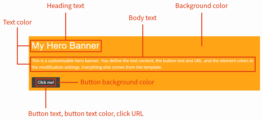
The following figure shows the modification you'll create and the parts that will be customizable in the underlying template.
To create the hero banner:
Creating the hero banner template
To create the hero banner template:
-
In the Frosmo Control Panel, in the sidebar, select Modifications.
-
Select the Templates tab.
-
Click Create template.
-
Define the following settings:
-
Name: Enter "Hero banner".
-
Export content: Leave this field to Automatic.
-
Minified: Leave this to Enabled.
-
Content type: Select In-page.
-
Content: Enter the following content for the template.
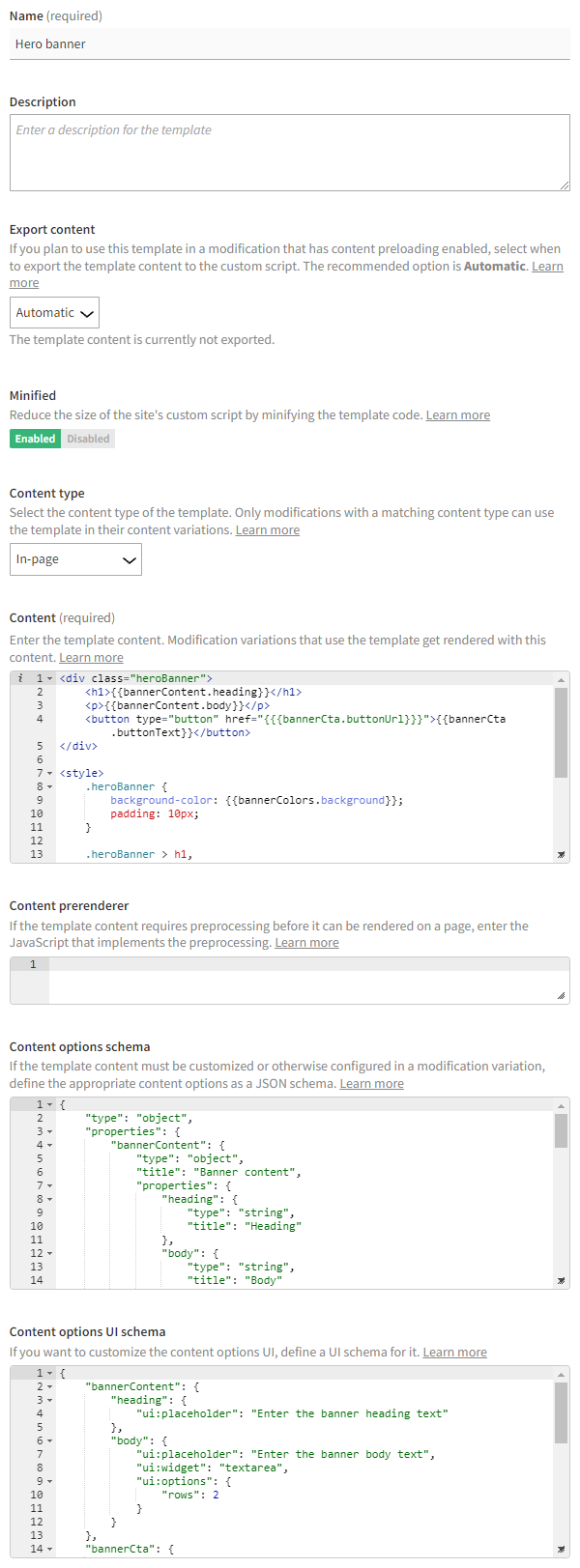
Content for the template<div class="heroBanner">
<h1>{{bannerContent.heading}}</h1>
<p>{{bannerContent.body}}</p>
<button type="button" href="{{{bannerCta.buttonUrl}}}">{{bannerCta.buttonText}}</button>
</div>
<style>
.heroBanner {
background-color: {{bannerColors.background}};
padding: 10px;
}
.heroBanner > h1,
.heroBanner > p {
color: {{bannerColors.text}};
}
.heroBanner > button {
background-color: {{bannerColors.buttonBackground}};
border: none;
color: {{bannerColors.buttonText}};
padding: 10px 20px;
}
</style>The content defines the HTML and CSS code for the hero banner. The content includes multiple Mustache variables, which need to be replaced with specific values in the modification. The variable for the button URL uses the triple mustache (
{{{bannerCta.buttonUrl}}}) so as not to escape any HTML characters, which would break the URL. -
Content prerenderer: Leave this field empty. This example does not use a content prerenderer.
-
Content options schema: Since the template content uses Mustache variables, enter the following content options schema for the template.
Content options schema for the template{
"type": "object",
"properties": {
"bannerContent": {
"type": "object",
"title": "Banner content",
"properties": {
"heading": {
"type": "string",
"title": "Heading"
},
"body": {
"type": "string",
"title": "Body"
}
},
"required": [
"body"
]
},
"bannerCta": {
"type": "object",
"title": "Banner CTA",
"properties": {
"buttonText": {
"type": "string",
"title": "Button text"
},
"buttonUrl": {
"type": "string",
"title": "Button URL"
}
},
"required": [
"buttonText",
"buttonUrl"
]
},
"bannerColors": {
"type": "object",
"title": "Banner colors",
"properties": {
"background": {
"type": "string",
"title": "Background color",
"default": "#ffa415"
},
"text": {
"type": "string",
"title": "Heading and body text color",
"default": "#ffffff"
},
"buttonBackground": {
"type": "string",
"title": "Button background color",
"default": "#3f3f3f"
},
"buttonText": {
"type": "string",
"title": "Button text color",
"default": "#ffffff"
}
}
}
}
}The schema describes the content options matching the Mustache variables in the template content. For each variable, the schema defines both the data type of the variable and the details for rendering a form input component for the variable in the content options UI. For example, the schema defines the
bannerContent.headingvariable as a string field with the label "Heading" and places the field under the "Banner content" section in the content options UI.For more information about defining the schema, see Creating and editing a template.
-
Content options UI schema: To further customize the content options UI, enter the following content options UI schema for the template.
Content options UI schema for the template{
"bannerContent": {
"heading": {
"ui:placeholder": "Enter the banner heading text"
},
"body": {
"ui:placeholder": "Enter the banner body text",
"ui:widget": "textarea",
"ui:options": {
"rows": 2
}
}
},
"bannerCta": {
"buttonText": {
"ui:placeholder": "Enter the button text"
},
"buttonUrl": {
"ui:placeholder": "Enter the URL that opens when a visitor clicks the button"
}
},
"bannerColors": {
"background": {
"ui:widget": "color"
},
"text": {
"ui:widget": "color"
},
"buttonBackground": {
"ui:widget": "color"
},
"buttonText": {
"ui:widget": "color"
}
}
}The UI schema defines additional settings for rendering each content option in the content options UI. For example, the UI schema defines placeholders texts for the text input fields and turns the color code fields into color picker widgets.
For more information about defining the UI schema, see Creating and editing a template.
The following figure shows the complete template in the Control Panel. Click the figure to view a larger version.
-
-
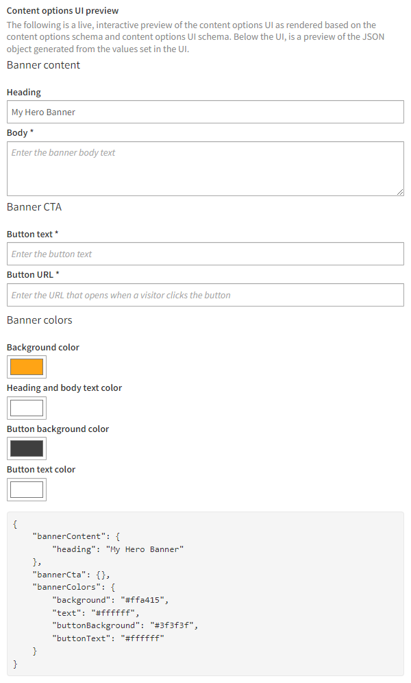
Use the content options UI preview at the bottom of the editor to test that the content options schema and content options UI schema are correctly defined.
The preview is fully interactive, so any changes you make to the schemas are automatically reflected in the preview. You can also set the content options in the preview as you would in the actual content options UI, and you can see a preview of the JSON object generated based on the set values.
The following figure shows the content options UI preview for template. In the figure, the user has entered "My Hero Banner" as the heading text. Click the figure to view a larger version.
-
Click Save.
You have created the template. For more information about template settings, see Creating and editing a template.
Creating the hero banner placement
In this example, you place the hero banner at the bottom of the page header. The example assumes a common header element with the ID header on each page. Your site likely has a different page architecture, however, so use whatever element best fits a hero banner.
To create the hero banner placement:
-
In the Control Panel, on the Modifications page, select the Placements tab.
-
Click Create placement.
-
Define the following settings:
-
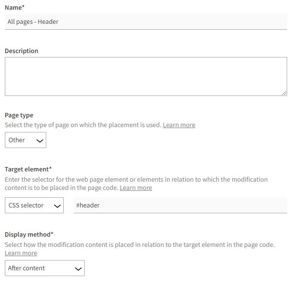
Name: Enter "All pages - Header".
-
Page type: Select Other.
-
Target element: Select CSS selector, and enter "#header" (or whatever is appropriate on your site) as the selector name.
-
Display method: Select After content.
The target element and display method together place the modification as the last piece of content within the header element.
-
-
Click Save.
You have created the placement. For more information about placement settings, see Creating and editing a placement.
Creating the hero banner modification
To create and activate the hero banner modification:
-
In the Control Panel, on the Modifications page, select the Overview tab.
-
Click Create modification.
-
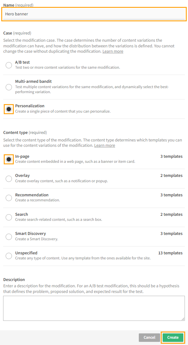
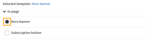
Enter "Hero banner" as the modification name, select Personalization as the modification case, select In-page as the content type of the modification, and click Create. You could also select another case, but since this modification needs only the one variation, Personalization is the natural choice here.
The Basic settings view opens.
-
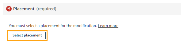
Select the placement for the modification:
-
In the Placement section, click Select placement.
-
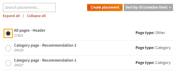
Select the placement you created for the hero banner.
-
Click Save.
-
-
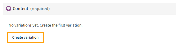
Define the content for the modification:
-
In the Content section, click Create variation.
-
In the variation settings, for Content source, select Template.
-
In the templates list, select the template you created for the hero banner.
-
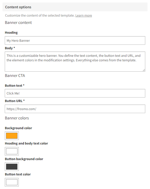
In the Content options section, define the content options. You must define at least the required options, which are marked with an asterisk (*). The following figure shows one example of setting the options.
-
Click Save.
-
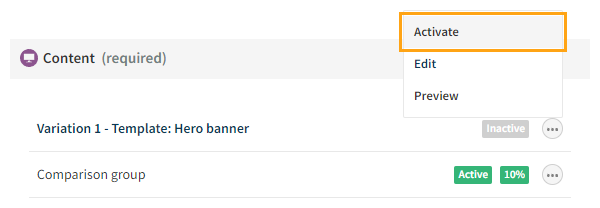
In the Content section, click the quick menu button for the variation, and select Activate.
-
If you want to disable the automatically created comparison group for the modification, click the quick menu button for the group, and select Deactivate.
-
-
Activate the modification:
-
At the bottom of the Basic settings view, click Activate.
-
To confirm, click Activate.
-
You have created and activated the modification. For more information about modification settings, see Creating and editing a modification.
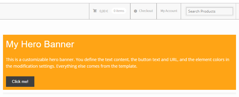
The hero banner is now live, and you're done with this example!