Creating and editing a template
Learn how to create and edit a template, define the settings for the template, and create a content options schema for adding dynamic content to the template.
Creating a template
To create a template:
-
In the Frosmo Control Panel, in the sidebar, select Modifications.
-
Select the Templates tab.
-
Click Create template.
-
Define the template settings.
-
When you're done, click Save.
-
To return to the templates list, click Close.
Editing a template
Be careful when editing a template that is in use, since changes to a template affect all modifications that use that template. In particular, if you edit the content of a template that is currently used in an active variation of an active modification, the changes will affect visitors who see the content.
To edit a template:
-
In the Frosmo Control Panel, in the sidebar, select Modifications.
-
Select the Templates tab.
-
In the templates list, find the template you want to edit, and click the template name.
-
Edit the template settings.
-
When you're done, click Save.
-
To return to the templates list, click Close.
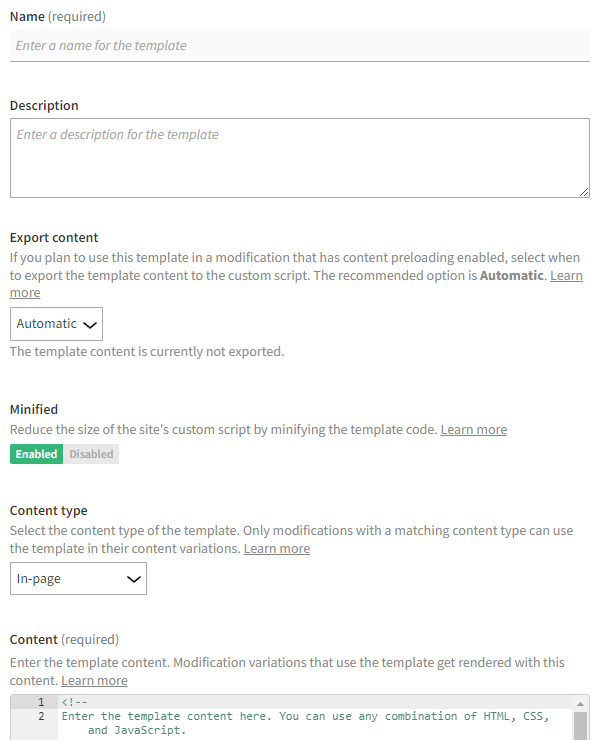
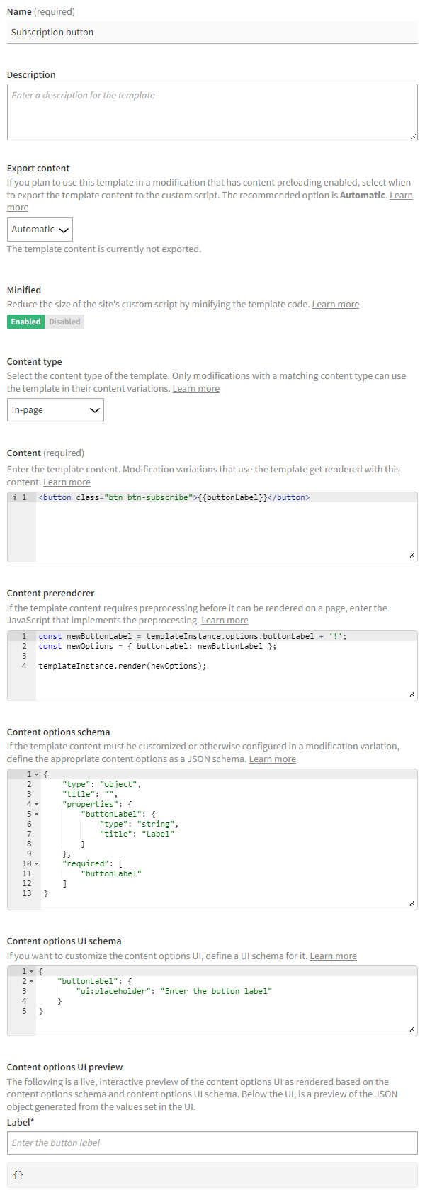
Template settings
The following table describes the settings you can define for a template in the Frosmo Control Panel.
| Setting | Description | Role |
|---|---|---|
Name | Enter a name for the template. | Required |
Description | Enter a description for the template. You can use the description to, for example, explain what sort of content the template renders, and when and how to use the template. | Optional |
Export content | Select when to export the template content to the site's custom script. Exporting the content means adding it directly to the custom script. Modifications that have content preloading enabled require the template content to be available in the custom script. Modifications that do not use content preloading get their content from the Frosmo back end, not from the custom script, so this setting does not affect them. By default, this is set to Automatic, which means the platform automatically determines whether the template content needs to be added to the custom script. The main reason to exclude the content from the custom script is if the template is currently not actively used in modifications that have content preloading enabled: either the template is not used in any modification variation, or the template is only used in variations that are inactive or whose modifications are inactive. warning Do not change this setting unless you're sure you know what you're doing. You can select from the following options:
The default option is Automatic. | Required |
Minified | Select whether to minify the template content and prerenderer code when exported to the site's custom script. Minifying the code can significantly reduce the size of the custom script file and thereby improve page load times, especially on sites with many templates. The default and recommended setting is Enabled. note Disable minification only for development or debugging purposes. For production use, always enable minification. tip If you need to disable minification for development or debugging purposes, instead of changing the production template, add the template to a workspace, and test the workspace template without minification. | Required |
Content type | Select the content type of the template. Only modifications with a compatible content type can use the template in their content variations. note The selected content type does not restrict what code you can enter in the other fields. However, the code must match the content type, so that users can trust their template selections in the modification variation settings. You can select from the following options:
| Required |
Content | Enter the template content. You can enter any combination of HTML, CSS, and JavaScript. You can use Mustache tags anywhere in the content to create placeholder elements for values. The tags get replaced with specific values in the rendered modification based on the content options you define in the template and map to the tags. You can allow the Control Panel users to set the content option values from a modification variation, or you can set the values directly in the Content prerenderer field. You can also mix these two approaches. You can use the following variables in the JavaScript code:
If you want to separate the structure, presentation, and static parts of the content (HTML, CSS, JavaScript) from the logic that defines the values for the Mustache tags (JavaScript), use the Content field for the former and the Content prerenderer field for the latter. tip When you create a new template, this field contains example code to get you started. You can remove the code if you don't need it. The following example content creates a button whose label is a Mustache variable with the key note By default, Mustache escapes HTML characters. For example, if the value of a Mustache variable contains the If you're using a Mustache variable as a URL, or if you otherwise do not want Mustache to escape any HTML characters in the variable, use the triple mustache: | Required |
Content prerenderer | Enter the JavaScript code for defining the values for the Mustache tags in the template content and for rendering the content with those values. Use this field for implementing the logic that needs to be executed before the content can be displayed on the page. While you can put all your JavaScript in the Content field, separating your prerendering logic from your presentation logic (content) makes it easier to manage each. tip If all the Mustache tag values can be defined directly in a modification variation, meaning you do not need to separately retrieve or otherwise build the values, leave this field empty, and instead define a content options schema for the template. You can use the following variables in the code:
To render the template content for the modification, call warning If you use the Content prerenderer field, but do not call The following example code takes the The following figures show the final modification as rendered on the page. 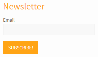 For a full practical example of a template that uses the prerenderer, see Example: Recommending trending products in a category. | Optional |
Content options schema | If the template content uses Mustache tags whose values must be set in the modification variation, or if defining the values requires some other input from the variation, enter a content options schema for the template. The Control Panel uses the schema to generate and display a content options UI in the variation settings. The UI allows users to set the Mustache tags to specific values for the variation. For more information about creating the schema, see Content options schema. tip When you create a new template, this field contains example code to get you started. You can remove the code if you don't need it. The following example schema describes a single content option: The following figures show the content options UI rendered from the preceding schema, with an example value, and the final modification as rendered on the page, respectively. (In this example, the template content uses a 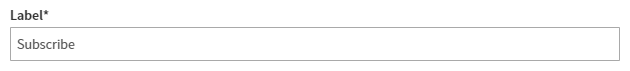 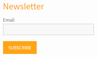 note If you do not enter a content options schema for the template, the content options UI of a variation that uses the template is a single text field, which expects a JSON object that defines the values for the Mustache tags. The following figure shows the content options UI and the JSON object for the preceding example when the template does not include a schema. In this case, whomever creates the modification variation must also provide the JSON object. 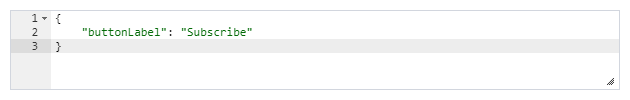 | Optional |
Content options UI schema | If you want to further customize the content options UI, define a UI schema for it. The UI schema is a JSON object that describes how specifically to render the form input components that make up the content options UI. The UI schema is specific to the For more information about the
tip When you create a new template, this field contains example code to get you started. You can remove the code if you don't need it. The following example UI schema customizes the 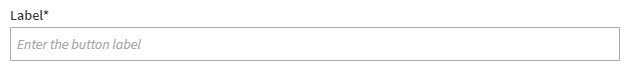 | Optional |
Content options UI preview | You can view a live, interactive preview of the content options UI as rendered based on the Content options schema and Content options UI schema. 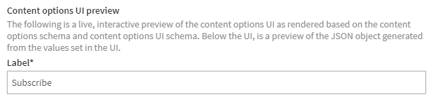 You can also preview the JSON object that gets generated from the values set in the content options UI. The Control Panel saves this object to the modification variation, and Frosmo Core uses the object to replace the Mustache tags in the template content with the actual values to render on the page. 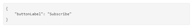 |
Content options schema
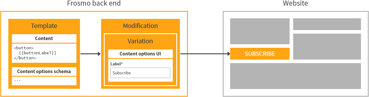
Content options allow you to customize template content for individual modifications. While all modifications that use the same template share the same basic content, the template can provide options for customizing that content per modification. The content options are based on the Mustache tags in the template content, and either directly provide the values for those tags or otherwise provide input that is required to define the final values. You define the content options in the template, but you set the options separately in each modification variation that uses the template. The template content together with the content options as set in a variation define what finally gets rendered on the page.
Example 1: Template content uses a Mustache variable for a customizable button label. You define a content options schema that describes the label, so that users can enter the desired label text in the modification variation.
Example 2: Template content uses a Mustache section for rendering a list of trending products. The product data for the list is fetched in the content prerenderer. However, fetching the data requires as input the number of products to list. You define a content options schema for the number, so that users can select the desired number of products in the modification variation, which then gets passed as input to the prerenderer.
The content options schema is a JSON schema that describes:
-
The data type of the value expected for each unique Mustache tag.
-
The details for rendering a form input component for each unique Mustache tag. The components together make up the content options UI for customizing the template content in a modification variation. The Frosmo Control Panel uses the
react-jsonschema-formReact component to build the UI. You set the Mustache tags to specific values in the UI when creating a modification variation.
For more information about how content options work in the modification flow, see Feature: Template.
Basic content options schema
The following is the minimum JSON schema for a content options schema. Use it as a blueprint when creating your own schemas.
{
    "type": "object",
    "title": "Content options",
    "properties": {
        "mustacheTagKey": {
            "type": "fieldDataType",
            "title": "fieldLabel"
        }
    }
}
In the basic schema, the parts that you need to customize are:
-
title: This is the title of the schema. The content options UI generated from the schema displays the title as its main heading. You can also leave the value empty or omit thetitleproperty entirely, in which case the content options UI displays no main heading. -
properties: This object defines the content options. You need to define a child object with at least thetypeandtitleproperties for each unique Mustache tag in the template content. The child object key is the Mustache tag key. Thetypeandtitleproperties define the data type and label of the option, respectively, and determine the form input component rendered for the option in the content options UI. For more information about the different data types, see Supported data types for content options.
Here's a schema that showcases a more complex set of content options:
{
    "type": "object",
    "title": "Content options",
    "properties": {
        "stringField": {
            "type": "string",
            "title": "String field",
            "description": "Enter a string"
        },
        "arrayField": {
            "type": "array",
            "title": "Array field",
            "description": "Add items to the array",
            "items": {
                "$ref": "#/definitions/arrayItem"
            }
        }
    },
    "required": [
        "stringField"
    ],
    "definitions": {
        "arrayItem": {
            "type": "object",
            "title": "Array item",
            "properties": {
                "stringField": {
                    "type": "string",
                    "title": "String field in an array item",
                    "description": "Enter a string"
                },
                "numberField": {
                    "type": "integer",
                    "title": "Number field in an array item",
                    "description": "Enter a number"
                }
            }
        }
    }
}
For more information about writing JSON schemas and what properties you can use in a JSON schema, see the official documentation:
To generate JSON schemas from JSON data, and to test your schemas, check out the JSON Schema Tool.
Supported data types for content options
The Frosmo Platform supports the following data types for content options.
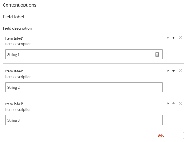
Array
An array contains a single items property, which defines the data type or types of the array items. Depending on the specific item settings, the Control Panel generates the content options UI with zero or more form input components, each representing an item, and with controls for adding and removing items as appropriate.
{
    "type": "object",
    "title": "Content options",
    "properties": {
        "arrayField": {
            "type": "array",
            "minItems": 1,
            "maxItems": 5,
            "title": "Field label",
            "description": "Field description",
            "items": {
                "type": "string",
                "title": "Item label",
                "description": "Item description",
                "default": ""
            }
        }
    }
}
The following figure shows the content options UI generated from the preceding array field example. The code below the figure is the JSON object generated from the settings shown in the figure.
{
    "arrayField": [
        "String 1",
        "String 2",
        "String 3"
    ]
}
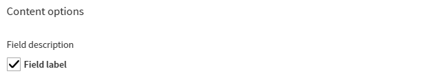
Boolean
{
    "type": "object",
    "title": "Content options",
    "properties": {
        "booleanField": {
            "type": "boolean",
            "title": "Field label",
            "description": "Field description",
            "default": false
        }
    }
}
The following figure shows the content options UI generated from the preceding Boolean field example. The code below the figure is the JSON object generated from the setting shown in the figure.
{
    "booleanField": true
}
Number
{
    "type": "object",
    "title": "Content options",
    "properties": {
        "numberField": {
            "type": "integer",
            "title": "Field label",
            "description": "Field description",
            "default": 0
        }
    }
}
The following figure shows the content options UI generated from the preceding number field example. The code below the figure is the JSON object generated from the setting shown in the figure.
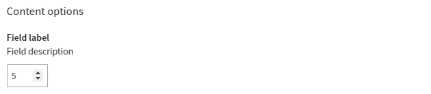
{
    "numberField": 5
}
Object
An object can contain any number of fields of any data type, including arrays and other objects. The Control Panel generates the form input components for these fields normally based on their data type.
{
    "type": "object",
    "title": "Content options",
    "properties": {
        "objectField": {
            "type": "object",
            "title": "Field label",
            "description": "Field description",
            "properties": {
                "key1": {
                    "type": "string",
                    "title": "Key 1 label",
                    "description": "Key 1 description",
                    "default": ""
                },
                "key2": {
                    "type": "integer",
                    "title": "Key 2 label",
                    "description": "Key 2 description",
                    "default": 0
                },
                "key3": {
                    "type": "boolean",
                    "title": "Key 3 label",
                    "description": "Key 3 description",
                    "default": false
                }
            }
        }
    }
}
The following figure shows the content options UI generated from the preceding object field example. The code below the figure is the JSON object generated from the settings shown in the figure.
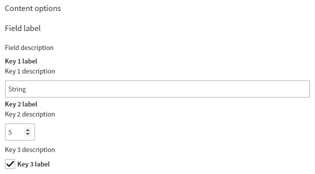
{
    "objectField": {
        "key1": "String",
        "key2": 5,
        "key3": true
    }
}
String
{
    "type": "object",
    "title": "Content options",
    "properties": {
        "stringField": {
            "type": "string",
            "title": "Field label",
            "description": "Field description",
            "default": ""
        }
    }
}
The following figure shows the content options UI generated from the preceding string field example. The code below the figure is the JSON object generated from the setting shown in the figure.
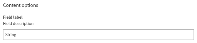
{
    "stringField": "String"
}
If the string contains HTML characters, and if you want those characters to render unescaped on the page, use the triple mustache in the Mustache variable you define in the template content: {{{unescapedVariable}}}.
<button class="btn btn-subscribe" href="{{{buttonUrl}}}">{{buttonLabel}}</button>